2016-2018
Over a year and a half, my UX team revised a publishing tool for Pearson that could create custom textbooks for college instructors. The existing tool had major usability problems and customers relied on Pearson staff to do the work for them. My skills at user experience research, mockups & prototypes, interactive design, and visual design all came into play on this project.
We made it easy for higher ed faculty to create textbooks themselves. Our redesign increased sales of custom textbooks by $6 million dollars over the next year.
Research
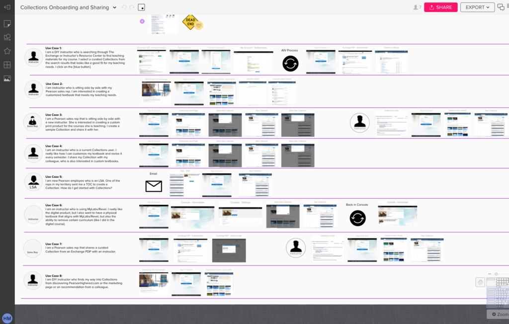
We created a journey map of how the current tool worked, and noted all the use cases for users.
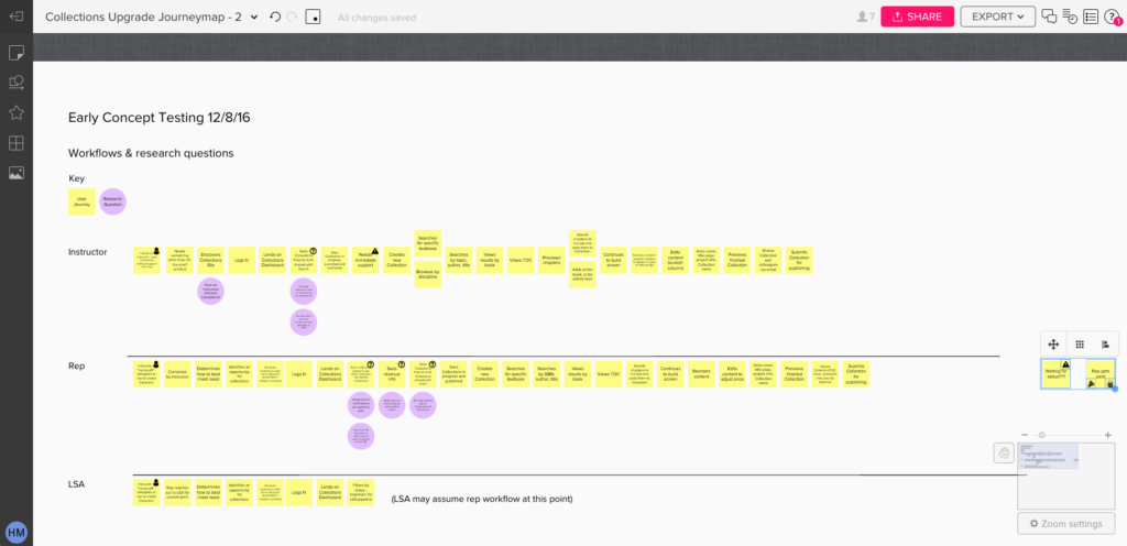
We did UX testing with both the current custom publishing tool and with our own lo-fi designs.
Instructors and University Administrators were our External Users. Interviews and product testing showed that:
- They needed a clear stepped-based process
- They needed pointers to remind them what came next
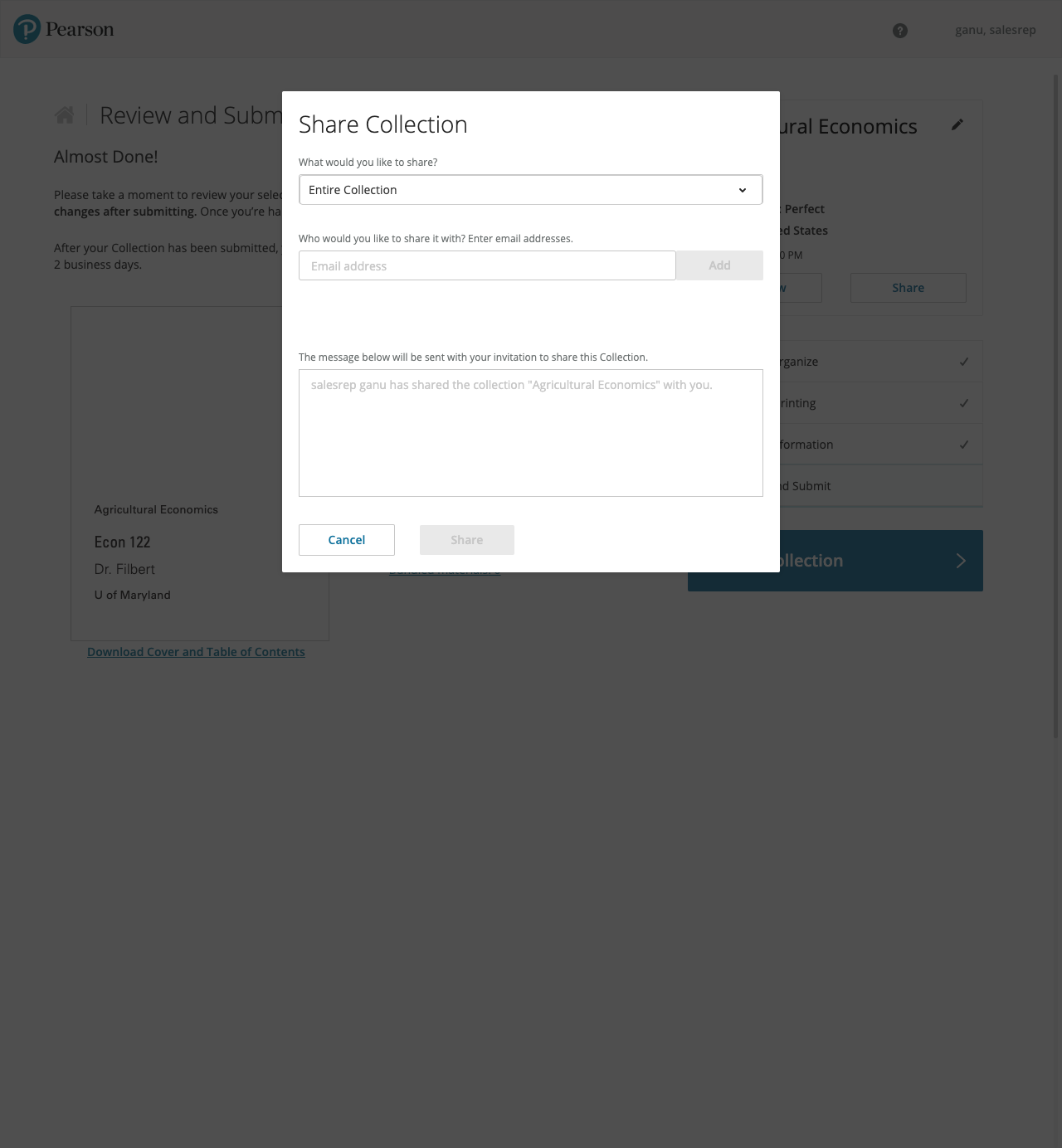
- They needed to preview the book before ordering it
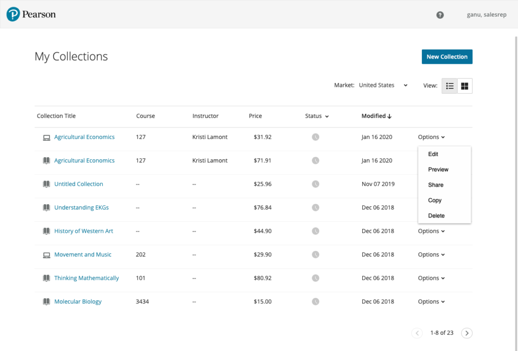
And Pearson’s Sales Representatives and Sales Support Staff were our Internal Users. Interviews and product testing showed that:
- They needed an interface that showed dozens of textbooks they were working on
- They didn’t need help tools that got in their way
Interaction Design
The home page and build screens for our custom publishing tool had some complex interactions that would help users achieve the tasks that they needed – and our two different sets of users had different needs.
To give all the users the tools the needed, we created separate user roles that allowed us to present different interfaces based on their needs.
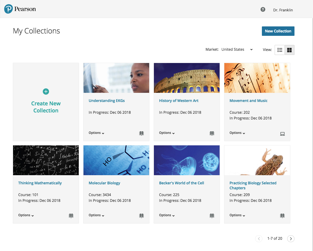
Home Page
Instructors had fewer books they were creating, so we could display their books with images to remind them which book they were working on, and class-related information they needed to identify what course the book was for. Contextual menus for instructors contained different items based on functionality.
Sales Representatives needed to work on dozens of titles at a time and to be able to search for books quickly, so we gave them a table view, search capabilities and information about book status.
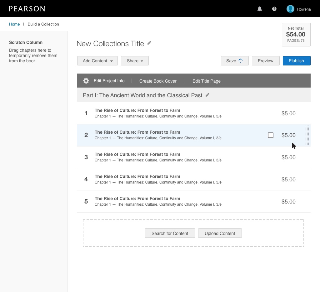
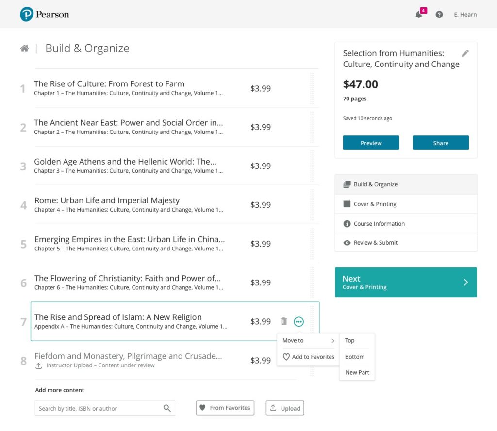
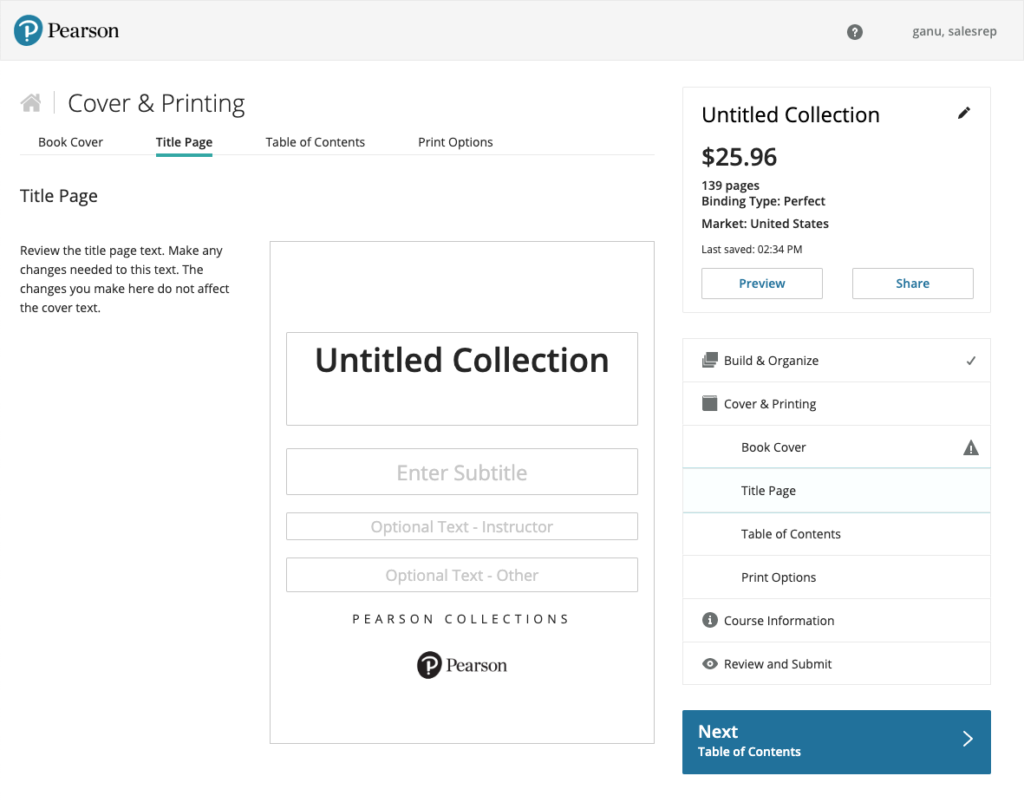
The Build Screen
We provided a stepped process and just-in-time help hints for Instructors that only touched the tool twice a year. Research showed they needed hints about what to do next. Hint boxes can be dismissed and stop showing after the tool is used twice.
To keep the user on the stepped path to finishing, some buttons appeared on screen but remained inactive until tasks were complete, when they would light up with an animation to help direct the eye at the new functionality.

Users can select chapters from existing textbooks and shape the book they want to match their course work.
The build screen needed to allow users to drag and drop chapters and scroll through dozens of chapters in a book, while keeping the right navigation panel on screen. Users also needed to be able to select multiple chapters and move them at once. Contextual menus allowed them to control some of the more complex selecting and moving tasks.
Selecting a single chapter
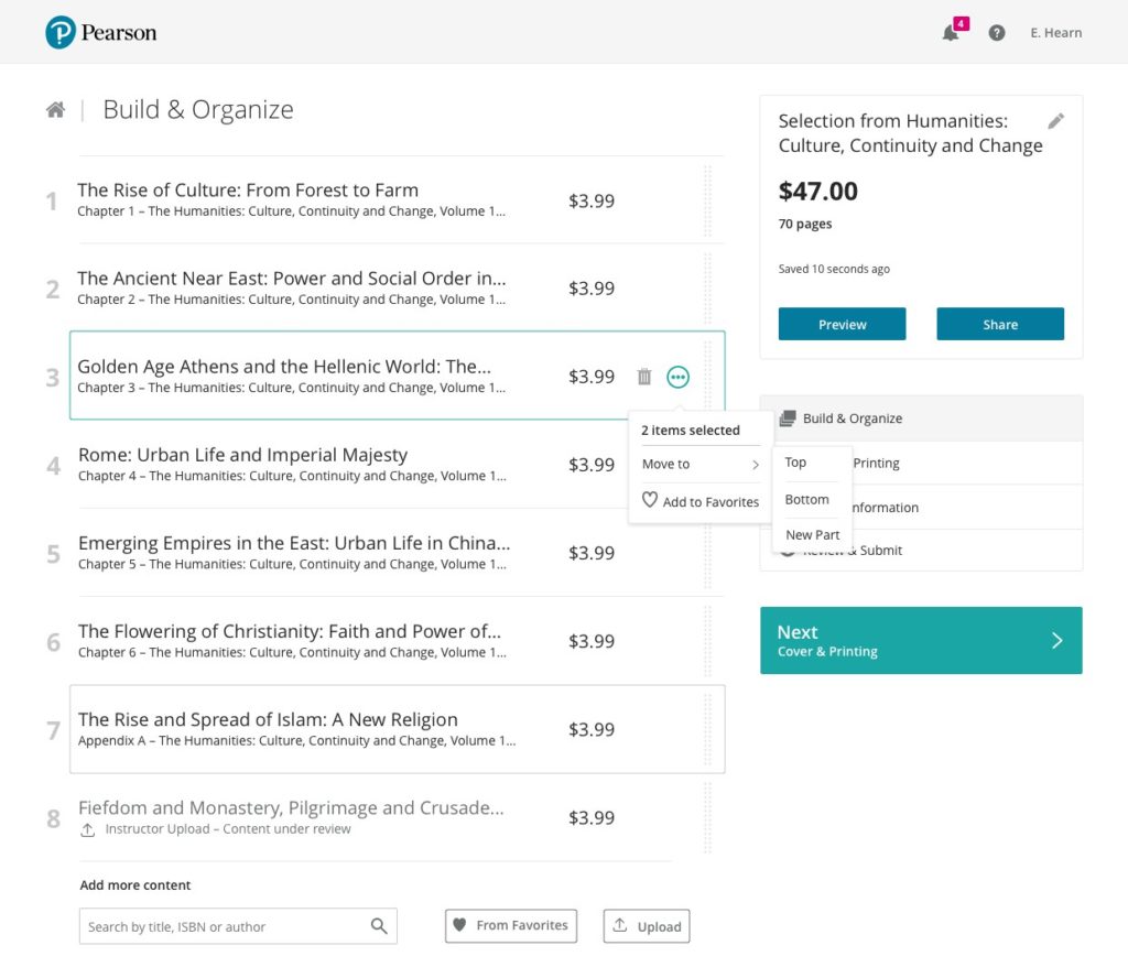
Selecting multiple chapters
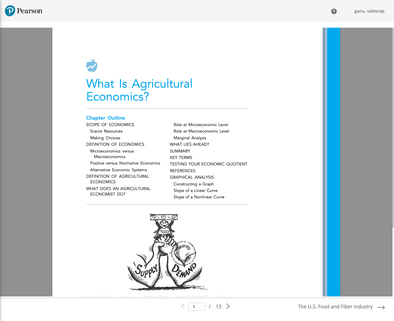
Once users had finished assembling their textbook, we allowed Instructors to preview their book and share it with other faculty before they had to commit to publish and purchase the textbook for their students.
Animations prototypes of interactive features
For our development team, we created animations of the interactive built page design that our users would need to assemble and reorder the chapters in their book. Because some textbooks are dozens of chapters long, we need to allow users to select multiple chapters to drag and drop, as well as providing contextual menus to delete or insert new chapters.
Creating animations of the drag and drop and contextual features helped our developers visualize how the interactions needed to happen.

Visual Design
Our visual design needed to be clean and simple to stay out of the user’s way while fitting with Pearson branding.

Testing, Testing, Testing
At each step of our design process, we worked with our design researcher to bring internal and external users into the process.
Final Launch
At launch, many of our users had already seen and worked with our new tool, so they were able to hit the ground running for the next semester, building custom textbooks for their colleges and universities.
After launch, we used analytics to monitor where users might be dropping out of the flow, so we could discover why.